COLOR Zone!

This month, Lets get into the COLOR Zone!
You may or may not know this, but photographing interiors can be a challenging feat.
Some may say, “How difficult can that be?” but they will soon realize while observing the process, that it is indeed a technical art-form.
Here’re just a few of the obstacles that Architectural Photographers have to deal with to insure they’re capturing the essence of any room lit with artificial light.
Without getting too technical, lighting as you know is the key to great photographic results. However, light is not just light for the sake of the word. Every light source that is not common in likeness, has a different COLOR. This is know as COLOR temperature and they are many. This COLOR temperature is not visible to the naked eye but very sensitive to the light capturing chip in a camera, especially a pro’s camera where control is everything.
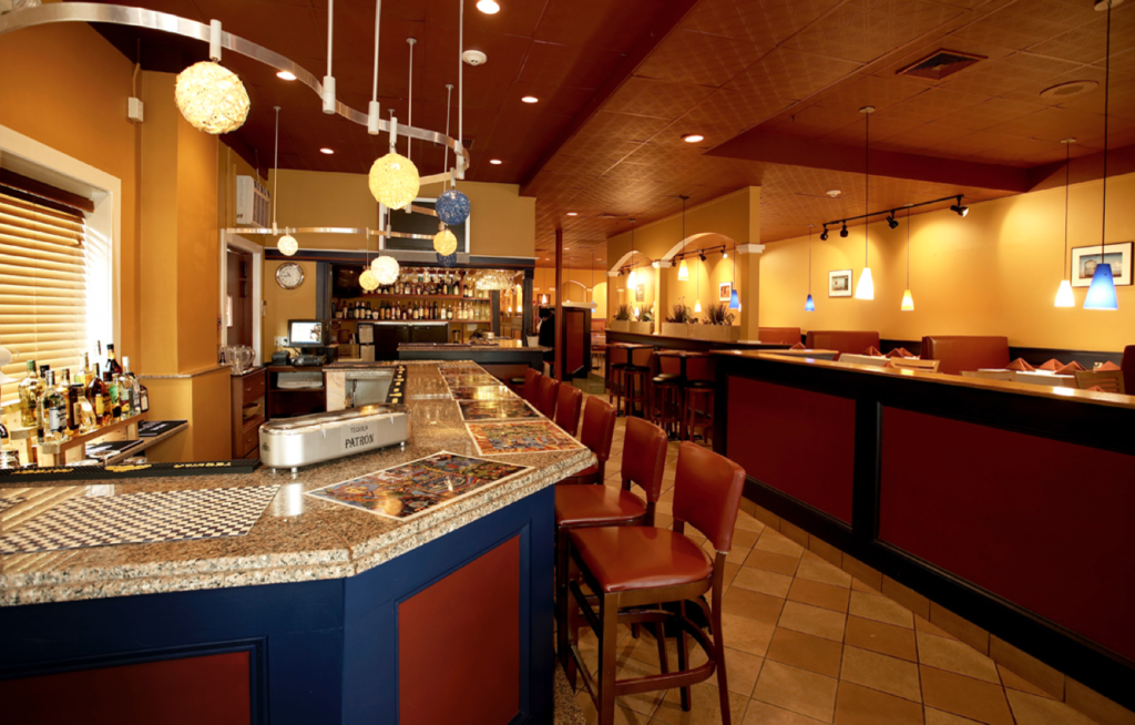
In this photo, there were at least three different light sources with different COLOR temperatures that I had to be aware of in order to maintain a true clean and consistent look throughout the room.
Here are the three I had to deal with and the invisible COLOR they emits.
1. Daylight……….Blue COLOR
2. Florescent……Green COLOR
3.Tungston………Yellow COLOR
I know it sounds like science but the only way to achieve great results in this area of photography, is to under not only how to light correctly but also to understand the COLOR temperature of the available lighting conditions.
Please study the COLOR and enjoy this image then pass it along to contacts who might have a need for clean COLOR in their Architectural Photos.
